In previous posts I talked about how to define WI fields, fields behaviors and states/transitions logic. Now it is time to talk about how work items UI is defined.
Let’s start with a small example:
<Form>
<Layout>
<Group>
<Column PercentWidth="100">
<Control Type="FieldControl" FieldName="System.Title"
Label="Title:" LabelPosition="Left" />
</Column>
</Group>
…
<TabGroup>
<Tab Label="Description">
<Control Type="HtmlFieldControl" FieldName="System.Description"
Label="Description:" LabelPosition="Top" Dock="Fill" />
</Tab>
…
</TabGroup>
</Layout>
</Form>
This example shows several important moments. First, all UI elements should be placed under LAYOUT element which in turn is placed under FORM element.
LAYOUT elements may host GROUP and TABGROUP elements. GROUP element groups child elements and may be viewed as “row” element (also optionally it may have a title). TABGROUP element contains one or more tabs (represented by TAB elements with titles). Both TAB and GROUP elements may contain several levels of nested groups.
To organize elements within a group, COLUMN elements may be used. While GROUP represents a row, COLUMN naturally represents a column and must have width specified (the width may be specified either in percents of total width or in pixels). All basic elements (LAYOUT, GROUP, TAB and COLUMN) have a set of common properties such as Padding and Margin.
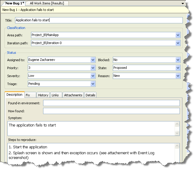
Those high level elements are used to organize controls representing the work item fields. Typical high-level UI organization of the form consists of several groups on the top part of the form (displaying general fields common to all work item types such as Title, State, Assigned To etc.) and tab control at the bottom part of the form (with tabs hosting work item specific fields). Here is the screenshot of MSF Agile Bug Work Item:
In addition to common attributes (Padding and Margin), every control has the following attributes:
- Type specifies how the field data will be displayed (to be discussed later)
- FieldName specifies what field is associated with the control (refname must be used)
- Label specifies user friendly descriptive text for the control (it may contain & for mnemonics)
- LabelPosition specifies how the label should be positioned relative to the control
- Dock attribute may be used to specify how (if at all) the control should fill the container
The way the data is displayed is defined by the Type specified. There are several predefined types of controls:
- FieldControl supports plain textual or numeric fields and lists of values (depending on the field it is associated with)
- HtmlFieldControl supports (optionally) rich format text, possibly multi-line
- DateTimeControl supports formatted date fields
Additionally, there are several special controls (that can be used only for specific data, and usually are displayed on dedicated tabs)
- WorkItemClassificationControl is special control used to display hierarchical AreaPath and Iteration fields values
- WorkItemLogControl displays work item history information (and it does not have associated field)
- LinksControl displays work item links information (and it does not have associated field)
- AttachmentsControl displays work item attachments (it does not have associated field as well)
With the basic information above in mind, it is easy to understand the example definition: we have Title text box taking the upper part of the form and underneath there is tab control with a single tab, hosting multi-line rich text box that fills the whole tab area.
For the limited set of UI elements available there is surprising number of customizations one can do. But what is one to do if the UI elements available do not answer the WI customization requirements? There is option to develop custom control providing for that custom logic using .NET, TFS SDK and your language of choice (though the development and deployment experience is not as basic as many would like that to be; we shall discuss it later).
This post rounds off the basics of custom Work Item templates definition syntax. Further I will try to touch upon some less explored corners and common approaches in customization.
Related posts:
- Work Item Customization: state transitions (part 3)
- Work Item Customization: conditional field behavior (part 2)
- Work Item Customization: fields definition (part 1)


No comments:
Post a Comment